Learning through Iteration: “Price Your Device” Widget
2025
UI+UX Design
ecoATM’s flagship product is a kiosk that will buy your old phone or tablet. In just minutes the kiosk inspects your device’s condition and pay you in cash on the spot. We offer convenience and speed over more DIY options like listing your device on Ebay or Facebook marketplace.

While a large majority of ecoATM users (88%) go directly to a Kiosk and get an estimate there, a smaller cohort of users prefer to get a price online before going to a kiosk. We found that these users sell us devices that are more desirable in the secondhand device market. So despite making up only 12% of our user base, the devices they sell contribute to 25% of our kiosk revenue.
Goal: Streamline our online “Price Your Device” widget to capture more of these premium devices.

Our previous “Price Your Device” widget spanned multiple pages and took you step-by-step through selecting your Brand, Model, Storage, Carrier, and Condition. We would use that information to give an offer, and if they accepted they would get a drop-off code they could enter at the kiosk.
We believed that the slow load times and step-by-step nature of the widget was causing users to drop-off at various points in the funnel. Our hypothesis was that by refactoring the widget to a single page application, it would speed up run time, decrease funnel drop-off and increase drop-off code generation.

In our first iteration we wanted to just prove out the concept without doing a total overhaul. I used components from our existing system to design a single page pricing widget. We also made the Brands & Model field a searchable drop-down so you didn’t have to scroll a long list

We ran this single page pricing widget against our existing pricing widget in a A/B test, and we were kind of surprised by the result. The single page version did not result in more drop-off code generation than its step-by-step counterpart. In fact it performed approximately the same.
I have a few hypothesis about this result:
- In both widgets we asked for the same information, offered them a price, collected their email, and gave them a drop-off code. The new experience, while more streamlined, was more or less the same.
- The primary driver for conversion is price. Users who are looking to sell their device online are typically shopping around for the best price, since the two experiences had the same prices, it did not influence user behavior in a meaningful way.
Despite the lukewarm result, there were several other business factors that encouraged us to iterate on the single page widget:
- We had a rebrand in 2024 which introduced new colors & fonts, and we wanted to give the widget a further facelift to build consumer trust
- There was some interest from our retail partners (where we install our kiosks) in hosting our widget on their websites, so there was a desire to make it more compact.
- The old pricing widget was slow, and we wanted to speed up the experience for our users.

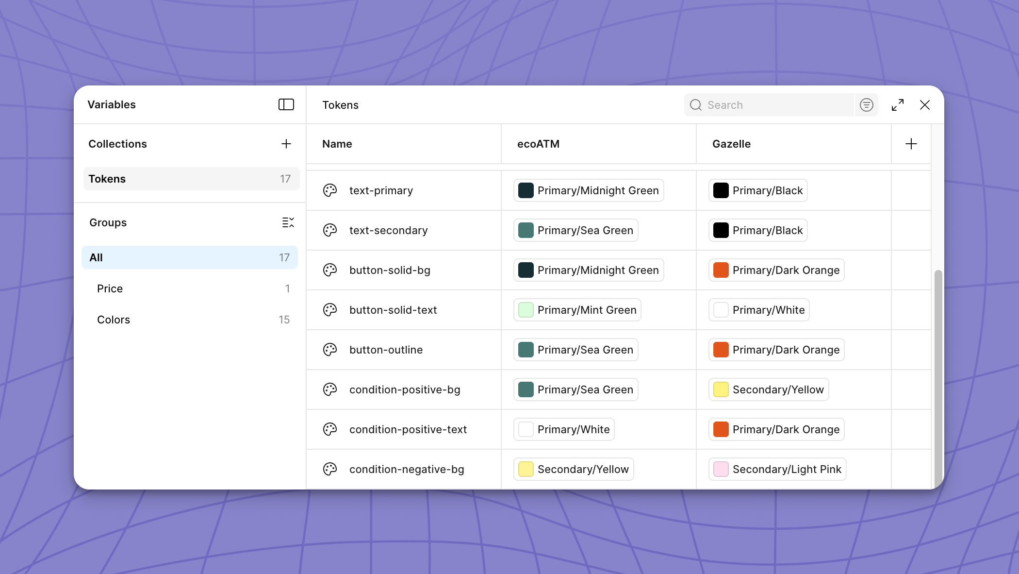
In version 2 of the “Price Your Device” Widget, we were given the okay to have more developer resources so we were able to make larger changes to our design components. I used our new brand colors and fonts to give our single page widget a brand new look.
This time we were able to see better results. Compared to version 1 of the single page pricing widget, version 2 drove 2.18% more drop-off code generations. This is about 73k net new drop-off codes, and $1.6M margin annually.
Why did version two perform better?
I have a few guesses on why version 2 performed better than version 1:
- The new widget looked nicer, which helped build trust with our users. People are more willing to sell to us because we look more reputable
- The new widget was much faster, because we had more engineering resources we were able to significantly speed up the experience from version 1
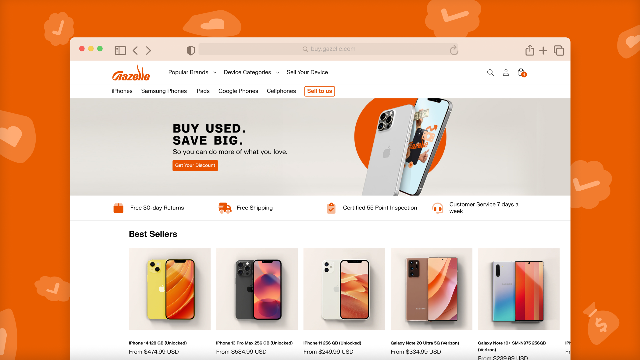
The added bonus of turning our pricing tool into a single page widget was that we were able to use it for our other business venture, Gazelle.com. Click here to see how I handled extending our widget to a different brand.